RSS

Category Archives: Visualization

Structure prediction without structure – visual inspection of BLAST results

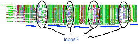
portschemaMy recent post on visual analytics in bioinformatics lacked a specific example, but I’m happy to finally provide one (happiness comes also from the fact that respective publication is finally in press). The image above shows a multiple pairwise alignment from BLAST of a putative inner membrane protein from Porphyromonas gingivalis. Image is small but it does not really matter – colour patches seem to be visible anyway.

Regions marked with ovals are clearly less conserved, than other part of the protein. There are five hydrophobic (green patches, underlined with blue lines) regions in this alignment (I ignore N-terminus, as this is likely the signal peptide), however the three inner ones appear to be of similar length, while the outer ones seem to be of the half as long as the inner ones. If we assume that the single unit is the short one, we can summarize the protein as follows: 8 beta structures, four long loops, for short loops. It looks like an eight-stranded outer membrane beta-barrel. Almost structure prediction, but without a structure.

I could end the story here, but the model didn’t fit previously published data. Its localization in the inner membrane was confirmed by an experiment, however pores in the inner membrane are considered very harmfull 😉 . Fortunately, one of my colleagues explained to me that particular localization technique is not 100% reliable, so I gathered more evidence, created detailed description of topology and the other group has designed experiments which confirmed my visual analysis.

Lessons learned? Maybe without this feedback on quality of that experimental technique, I would still claim that this is OM beta-barrel. Or maybe not. But I’ve learned that to safely ignore experimental results, one needs a more than a intuition. Also, it shows that sometimes looking at the results, is all one needs to make a reasonable prediction (I still have no idea what were E-values of these BLAST hits, but does it matter?).

Reblog this post [with Zemanta]
 
7 Comments

Posted by on February 3, 2009 in bioinformatics, Research, Visualization


Tags: , , , , ,

Timestamped FriendFeed activity – really public “profile”

Accidentaly, I have found a simple way for obtaining a time stamp for each entry and comment any person with publicly available lifestream makes on FriendFeed (except “Likes”, which do not seem to be timestamped at all). Activity of semi-randomly choosen person during the day (summarized over couple of weeks (!))  is shown below:

FriendFeed usage during 24 hours, summarized over couple of days.

FriendFeed usage during 24 hours, summarized over couple of days.

While relation between AM and PM periods is correct, time-zone is manually shifted, so it’s more difficult to guess who’s this activity is (but it’s not Robert Scoble if you want to ask). What does it tell? Basically, this person does not close FriendFeed window for the most of the day. Additionally, there’s a period of the day in which “catching-up” has place. Nothing interesting so far? Original data has much more details. It is possible for example to collect information when during the day particular person usually watches videos on YouTube. Guess – is that during working hours? 🙂

Ability to get that data for couple of weeks back without any trouble (I didn’t need to track this person’s activity for such period) was kind of disturbing. I knew it’s very simple to start tracking my habits, but I wasn’t aware of the fact that it’s also easy to see what I was doing over the last three weeks. Do you think it makes a difference?

Reblog this post [with Zemanta]
 
Comments Off on Timestamped FriendFeed activity – really public “profile”

Posted by on January 29, 2009 in Comments, Visualization


Tags: , , ,

Science & Art: what language do you use?

TED 08
Image by cr8it via Flickr

I’ve just realized where is the important difference between artists and scientists – and probably the biggest challenge of the merging or communicating between these two areas. When we do research, we tend to think in words. When we paint, we tend to think in colors. When we compose, we tend to think in sounds. Our right hemisphere thinks in colors, images, feelings or sounds, while the left thinks almost exclusively in words/in symbols. This is of course an over-generalization, but still I think it’s very important point when discussing relations between science and art. Putting right hemisphere experience into words is so difficult task, that most of such attempts sounds like gibberish. Have you watched TED talk “My stroke of insight”? Jill Bolte Taylor shared her first person observations from the stroke, which turned off her left (logical and analytical) hemisphere. While she did great job (also of not going too much into details), still some commenters were complaining about scientific quality of these observations (or that she sounded like she were on drugs, which is by the way not a coincidence).

If that sound too abstract to you, consider history of discovery of benzene. Kekulé had a day dream of snake  seizing its own tail – and interpreted it correctly. And I believe this is not a single example, where solution to a scientific problem presents itself to a researcher in some non-linguistic form (or rather right hemisphere sends solution to left hemisphere). However, such stories are rare for a couple of reasons: we are not usually aware of the fact that “artistic” hemisphere can “solve” scientific problems, we lack skills to identify and translate such messages, and finally it seems unprofessional to admit that we had a “vision” that led to a successful solution.

I’m not sure about correctness of these speculations. It has been quite difficult to get to that point, exactly because of limits of linguistic description of the Art (I rarely can stand an artist’s statement), so it’s likely I’ve made some mistakes on the way. Therefore I would appreciate any help along the way.

Reblog this post [with Zemanta]
 
8 Comments

Posted by on January 27, 2009 in Science and Art, Visualization


Tags: , , , , , , ,

Another collaborative environment: Project Wonderland

This is a short post on the Sun’s Project Wonderland. Citing from its home page

Project Wonderland is a 100% Java and open source toolkit for creating collaborative 3D virtual worlds. Within those worlds, users can communicate with high-fidelity, immersive audio, share live desktop applications and documents and conduct real business. Wonderland is completely extensible; developers and graphic artists can extend its functionality to create entire new worlds and new features in existing worlds.

In my recent post I’ve mentioned Second Life and Croquet: two platforms that can evolve into decent 3D visualization environments. Obviously I didn’t research the topic enough, as I’ve just found Project Wonderland. It seems to have the best of both worlds – professional team of developers, pretty flexible architecture and possibility of running your own instance of “virtual world”.

)

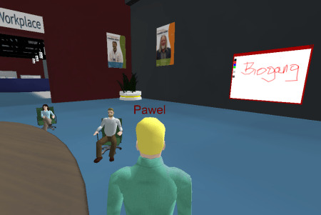
Have you spotted "Biogang" written on the whiteboard? 🙂

I didn’t play with it for a long time – current version is not very feature-rich (although it already contains video player with webcam support, PDF viewer, VNC viewer and a crude whiteboard), however the roadmap looks very interesting. I really liked extensive audio features – true stereo, sounds fade out with distance, special “cone of silence” (place where you can have a private conversation) – it proves that Sun is really trying to build an effective collaboration platform.

I haven’t seen yet much about data visualization in Wonderland – although below you can find interesting example of molecular simulation trajectory shown inside Wonderland.

Reblog this post [with Zemanta]
 
Comments Off on Another collaborative environment: Project Wonderland

Posted by on December 29, 2008 in Education, Research, Visualization


Tags: , , ,

Bioinformatics is a visual analytics (sometimes)

Short description of my research interest is “I do proteins” (I took this phrase from my friend Ana). I try to figure out what particular protein, protein family, or set of proteins does in the wider context. Usually I start where automated methods have ended – I have all kinds of annotation so I try to put data together and form some hypothesis. I recently realized that the process is basically visualizing different kind of data – or rather looking at the same issue from many different perspectives.

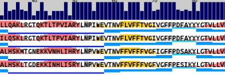
It starts with alignments. Lots of alignments. And they all end up in different forms of visual representation. Sometimes it’s a conservation with secondary structure prediction (with AlignmentViewer or Jalview):
blog-0005

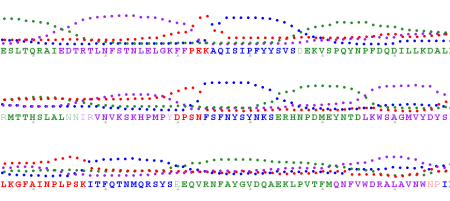
Sometimes I look for transmembrane beta-barrels (with ProfTMB):
blog-0005

Sometimes I try to find a pattern in hydrophobicity and side-chain size values across the alignment (Aln2Plot):

blog-0005

Afterwards I seek for patterns and interesting correlations in domain organization (PFAM, Smart):

blog-0008

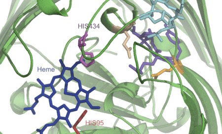
Sometimes I map all these findings onto a structure or a model that I make somewhere in the meantime based on found data (Pymol, VMD, Chimera):
blog-0006

I also try to make sense out of genomic context (works for eukaryotic organisms as well – The SEED):

blog-0005

I investigate how the proteins cluster together according to their similarity (CLANS):

blog-0013

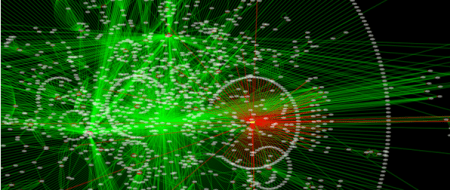
And figure out how the protein or the system I’m studying fits into interaction or metabolic networks (Cytoscape, Medusa, STRING, STITCH):
blog-0007

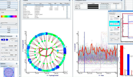
If there’s some additional numerical information I dump it into analysis software (R, for simpler things DiVisa):
blog-0005

And I make note along the process in the form of a mindmap (Freemind, recently switched to Xmind, because it allows to store attachments and images in the mindmap file, not just link to them like Freemind does):blog-0010

So it turns out that I mainly do visual analytics. I spend considerable amount of time on preparing various representations of biological data and then the rest of the time I look at the pictures. While that’s not something every bioinformatician does, many of my colleagues have their own workflows that also rely heavily on pictures. For some areas it’s more prominent, for others it’s not, but the fact is that pictures are everywhere.

There are two reasons I use manual workflow with lots looking at intermediate results: I work with weak signals (for example, sometimes I need to run BLAST at E-value of 1000) or I need to deeply understand the system I study. Making connections between two seemingly unrelated biological entities requires wrapping one’s brain around the problem and… lots of looking at it.

And here comes the frustration. I counted that I use more than twenty (!) different programs for visualization. And even if I’m enjoying monitor setup 4500 pixels wide which is almost enough to put all that data onto screen, the main issue is that the software isn’t connected. AlignmentViewer cannot adjust its display automatically based on the domain I’m looking at or a network node I’m investigating – I need to do it by myself. Of course I can couple alignments and structure in Jalview, Chimera or VMD but I don’t find such solution to be usable on the long run. To have the best of all worlds, I need to juggle all these applications.

I’ve been longing for some time already for a generic visualization platform that is able to show 2D and 3D data within the single environment, so I follow development of SecondLife visualization environment and Croquet/Cobalt initiatives. While these don’t look very exciting right now, I hope they will provide a common platform for different visualization methods (and of course visual collaboration environment).

But to be realistic, visual analytics in biology is not going to become a mainstream. It’s far more efficient to improve algorithms for multidimensional data analysis than to spend more time looking at pictures. I had already few such situations when I could see some weak signal and in a year or two it became obvious. But I’m still going to enjoy scientific visualization. I came to science for aesthetic reasons after all. 🙂
Reblog this post [with Zemanta]
 

Tags: , , , , , , , ,

Qutemol and Ubuntu – native support

A Snapshot of the QuteMol open source software...

Image via Wikipedia

A week ago I got an email from a long-time-no-see friend, Marcin Feder, with information that Qutemol works fine on the Hardy and Gutsy versions of Ubuntu (binary packages were prepared by Morten Kjeldgaard; see more https://blueprints.launchpad.net/~mok0/+related-software, there are some other interesting titles there). According to Marcin following steps are enough to enjoy Qutemol on your linux box:

sudo aptitude install libungif4g  libwxbase2.8-0 libwxgtk2.8-0
wget http://mirrors.kernel.org/ubuntu/pool/main/g/glew/libglew1.4_1.4.0-1ubuntu1_i386.debhttp://ppa.launchpad.net/mok0/ubuntu/pool/main/q/qutemol/qutemol_0.4.1~cvs20080130-0ubuntu1~gutsy~ppa1_i386.deb
sudo dpkg -i libglew1.4_1.4.0-1ubuntu1_i386.deb
sudo dpkg -i qutemol_0.4.1~cvs20080130-0ubuntu1~gutsy~ppa1_i386.deb
I have too ancient Ubuntu version to check it right now, but not all of you are so lazy with upgrades so have fun.
Reblog this post [with Zemanta]
 
5 Comments

Posted by on October 16, 2008 in Visualization


Tags: , , ,

Many Eyes and literature summary

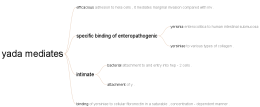
I’m not the first one to come up with this idea – Ntino posted about it before. However, I didn’t really understand before how powerful it could be. Using Many Eyes visualization capabilities I’ve created a quick browsable summary of abstracts related to a particular protein. I took all abstracts PubMed returned for a particular query (in this case it was “YadA Yersinia”; YadA is a prominent adhesin and important pathogenicity factor in Yersiniae) and uploaded them as text into Many Eyes. I chose “Word Tree” representation and searched for “yada”, which gave a nice graph of the most prominent phases related to this protein/gene name. Maybe it’s not a breakthrough, but compared to the classification/semantification provided by GoPubMed, such approach works much better for entities that aren’t well described in biological ontologies.

Given that the whole concept is pretty straightforward, it would be nice if one of alternative PubMed search engines provided a similar method of summarizing user’s query, don’t you think?

Reblog this post [with Zemanta]
 
9 Comments

Posted by on October 4, 2008 in Papers, Research, Visualization


Tags: , , , , , , ,

Skyrails and STRING

Of course I couldn’t resist not to play a little bit with Skyrails after I saw it at Flowing Data blog. Skyrails is a graph visualization system that was designed with expandability and awesome look in mind. All menus can be programmed in odd-looking, but quite easy to learn language, which helps in writing customized interface to particular data.

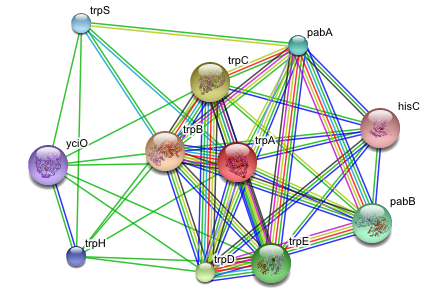
My quick attempt was to take some sample data from STRING, feed it into Skyrails and see if that makes any sense. My choice was #1 example from STRING main page, which was trpA protein from E. coli K12. The main graph on the trpA interactions page looks as follows:

The same graph in Skyrails:

Of course Skyrails has a 3D representation, is fully interactive, with a little work one can filter some of the connections out, put images of structures instead of green dots, etc. etc. It doesn’t look as clear as STRING, because it wasn’t optimized for such use – in practice it’s much clearer. The video below shows the basic interactions with this dataset.

Is it useful? At the moment, not really. It has already lots of features that more mature programs lack (completely programmable menus are great idea), but usage is still crude and in some cases the flashy effects are disturbing. However, it’s worth to keep an eye on Skyrails. First, development is pretty much guaranteed, as the author said he starts a PhD on this project. Second, the basic roadmap includes features that again aren’t present anywhere else, like client-server architecture (so you can talk to Skyrails system from external application – dynamic, time-aware visualization?). And third – it’s the most cool-looking visualization system I’ve found so far (will it make into a movie, like Genome Valence from Ben Fry did?).

Reblog this post [with Zemanta]
 
2 Comments

Posted by on September 9, 2008 in Software, Visualization


Tags: , , , ,

Relaxing before weekend – PDB file and Panda3D

Software for visualization of molecules is in majority of cases very focused on its job and rarely allows for something outside its scope (one of exceptions is VMD – you can plot 3d surfaces using its graphic engine). Every couple of months I check status of various 3D engines to see how they are suited for molecular visualization. Recently, I had another look at Panda3D, free 3D engine Disney is using to do some of its games. As an exercise in Python I’m learning right now, I’ve tried to import a PDB file into Panda3D and rotate it.

Panda3D doesn’t have a native support for molecules, instead it supports its own egg format for models. Fortunately, there’s an egg format exporter for Blender, so I imported hemoglobin molecule in cartoon representation into Blender (procedure described at the bottom of this page) and then exported in Panda3D format. The rest was pure Python (and extensive copy/paste from tutorials found on the web). Following code will load model from hbg.egg file, set up some lights and rotate camera around it.

import direct.directbase.DirectStart
from direct.showbase.DirectObject import DirectObject
from pandac.PandaModules import *
from direct.task import Task
import math

#Load the protein model
protein = loader.loadModel("hbg")
protein.reparentTo(render)
protein.setScale(1.4)
protein.setPos(0,0,2)

#setup lights
light1 = AmbientLight('light1')
light1.setColor(VBase4(0.12, 0.12, 0.12, 1))
plnp = render.attachNewNode(light1)
render.setLight(plnp)

light2 = PointLight('pointlight')
plnp2 = render.attachNewNode(light2)
plnp2.setPos(0,0,2)
render.setLight(plnp2)

#Task to move the camera
def SpinCameraTask(task):
  angledegrees = task.time * 6.0
  angleradians = angledegrees * (math.pi / 180.0)
  base.camera.setPos(20*math.sin(angleradians),-20.0*math.cos(angleradians),2)
  base.camera.setHpr(angledegrees, 0, 0)
  return Task.cont

base.setBackgroundColor(0.0,0.0,0.0)
taskMgr.add(SpinCameraTask, "SpinCameraTask")

run()

Not so impressive screenshot is shown at the top. It’s not a rocket science and state-of-the art visualization, but I’m positively surprised how easy is today to get such thing up and running. Game industry is a large one and even proprietary engines are quite cheap (for non-commercial purposes one can have them for small hundreds of dollars), so I expect quite a few scientific projects built on such platforms coming soon. SL engine is not the last one to be used for such purpose.

Reblog this post [with Zemanta]
 
2 Comments

Posted by on August 15, 2008 in Visualization


Tags: , , , ,

Visualization of internal repeats in proteins (or DNA)

There’s a number of protein families that have internal repeats (like TPR, Armadillo, ankyrin etc.). I’m very interested in many of them for reasons I will explain in other post. Assessing arrangement of these repeats is straightforward in majority of cases – most of them tend to occur next to each other, with little or no insertions between them (finding them at first is completely different story). However, there are proteins where internal repeats are separated by other domains or repeats, which can result in a real mess (or in scientific language: mosaic-like architecture). When couple of months ago I looked for some visualization method that would allow me to have a quick overview of internal structure of such proteins, I’ve stumbled across The Shape of Song – visualization method developed by Martin Wattenberg, researcher at IBM. This fitted my requirements so I’ve implemented it with some help of Processing (and which I’ve added later to a protein analysis server that has a chance to be published next month). Resulting visualization is below:

Internal repeats in a protein

Repeats are colored according to repeat type and are connected according to repeat family. If you think about it in terms of SCOP (Structural Classification of Proteins) hierarchy, colors represent class, while arcs connect superfamilies. The longer and more complicated analysed sequence is, the more useful this approach seems to be, so for short proteins typical domain bubbles would work better.

People that are into genomic sequences may notice similarity of this approach to Circos developed by Martin Krzywinski (whose work I really admire, especially on HDTR). Basically the idea behind both is pretty much the same, but I’ve never thought about straightening that circle until I saw The Shape of Song. My thinking is sometimes dramatically schematic…


Tags: , , , , ,