Of course I couldn’t resist not to play a little bit with Skyrails after I saw it at Flowing Data blog. Skyrails is a graph visualization system that was designed with expandability and awesome look in mind. All menus can be programmed in odd-looking, but quite easy to learn language, which helps in writing customized interface to particular data.
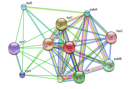
My quick attempt was to take some sample data from STRING, feed it into Skyrails and see if that makes any sense. My choice was #1 example from STRING main page, which was trpA protein from E. coli K12. The main graph on the trpA interactions page looks as follows:

The same graph in Skyrails:

Of course Skyrails has a 3D representation, is fully interactive, with a little work one can filter some of the connections out, put images of structures instead of green dots, etc. etc. It doesn’t look as clear as STRING, because it wasn’t optimized for such use – in practice it’s much clearer. The video below shows the basic interactions with this dataset.
Is it useful? At the moment, not really. It has already lots of features that more mature programs lack (completely programmable menus are great idea), but usage is still crude and in some cases the flashy effects are disturbing. However, it’s worth to keep an eye on Skyrails. First, development is pretty much guaranteed, as the author said he starts a PhD on this project. Second, the basic roadmap includes features that again aren’t present anywhere else, like client-server architecture (so you can talk to Skyrails system from external application – dynamic, time-aware visualization?). And third – it’s the most cool-looking visualization system I’ve found so far (will it make into a movie, like Genome Valence from Ben Fry did?).
![Reblog this post [with Zemanta]](https://i0.wp.com/img.zemanta.com/reblog_e.png)


