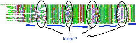
 My recent post on visual analytics in bioinformatics lacked a specific example, but I’m happy to finally provide one (happiness comes also from the fact that respective publication is finally in press). The image above shows a multiple pairwise alignment from BLAST of a putative inner membrane protein from Porphyromonas gingivalis. Image is small but it does not really matter – colour patches seem to be visible anyway.
Regions marked with ovals are clearly less conserved, than other part of the protein. There are five hydrophobic (green patches, underlined with blue lines) regions in this alignment (I ignore N-terminus, as this is likely the signal peptide), however the three inner ones appear to be of similar length, while the outer ones seem to be of the half as long as the inner ones. If we assume that the single unit is the short one, we can summarize the protein as follows: 8 beta structures, four long loops, for short loops. It looks like an eight-stranded outer membrane beta-barrel. Almost structure prediction, but without a structure.
I could end the story here, but the model didn’t fit previously published data. Its localization in the inner membrane was confirmed by an experiment, however pores in the inner membrane are considered very harmfull 😉 . Fortunately, one of my colleagues explained to me that particular localization technique is not 100% reliable, so I gathered more evidence, created detailed description of topology and the other group has designed experiments which confirmed my visual analysis.
Lessons learned? Maybe without this feedback on quality of that experimental technique, I would still claim that this is OM beta-barrel. Or maybe not. But I’ve learned that to safely ignore experimental results, one needs a more than a intuition. Also, it shows that sometimes looking at the results, is all one needs to make a reasonable prediction (I still have no idea what were E-values of these BLAST hits, but does it matter?).
![Reblog this post [with Zemanta]](https://i0.wp.com/img.zemanta.com/reblog_e.png)


