RSS

Category Archives: Software

Survey of domain bubbles in protein sequence analysis

One of the key step in the analysis of unknown protein sequence is identification of domains that constitute that protein. There are many online tools that will search for a presence of known domains or identify them ab inito. Usually only the former present results in a graphical way called “domain bubbles”. Below you can find examples of common approaches to presenting results of a sequence annotation. Since most of them use the same domain definitions, names of the hits are the same in almost all cases.

One note: it’s not a comparison of the servers’ performance. The sequence is the same in all cases, but that was to show the differences between visualization methods, not the quality of the annotation.

SMART

SMART domain bubbles

This is example of sequence annotation by the SMART server. Domains are colored according to their source (SMART has a collection of domain definitions from various different sources), and non-domain sequence features (like transmembrane segments, low-complexity, disorder) are clearly differentiated from domains. The picture is generated with GIMP and it’s Perl-Fu extension and the script is available for download from a homepage of Ivica Letunic.

PFAM

PDAM domain bubbles

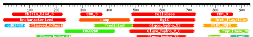
Color schema by PFAM is quite clear – the same domains have the same colors. PFAM (as well as following two servers) shows in the picture partial hits – this is the case where similarity between the domain and the protein spans only fragment of the domain (that may indicate many things, like genomic rearrangements, frameshifts, weak domain definition, etc). But PFAM script can actually plot many other sequence features onto the picture. You can use the script with your own annotation data here – the input is coded as a xml file conforming PFAM’s schema.

CDD

CDD domain bubbles

CDD looks pretty similar to the PFAM and shares some visual features. However, CD-Search page shows in a graphical way more than one line of hits. Usually the first line contains the best hits for the particular fragment, and following lines show overlapping hits with worse score. Here is shown only the first line.

HHpred

HHpred domain bubbles

OK, I may be biased here, since the HHpred is coded by my former colleagues, but I really like the domain bubbles from this server. Color schema is different from any other servers: bubbles are colored according to the score, from red (the best) to blue (the worst). Also it shows partial and overlapping hits (here are shown only few, the actual results page spans few screens in my browser). Similar to CDD, HHpred does not plot any other sequence features than domains.

So here are the major domain annotation servers which present results of the prediction in a nice graphical way (there are many others, but not all of them are using this simple way of presenting data, just to mention InterPro). Are these, after all pretty similar, approaches exploring all possible ways of presenting domain structure of a protein? I don’t think so. Watch this site, I may have something to add pretty soon.

 
8 Comments

Posted by on September 24, 2007 in Software, Visualization


Tags: , , ,

Many Eyes for bioinformatics?

It’s already a while since IBM launched their data visualization framework Many Eyes. While initially resistant (there’s nothing that Gnuplot/R/Graphviz cannot do) I’ve decided to have a closer look. Obviously I didn’t get it before – Many Eyes is not about making the visualization easier (although IBM did quite a lot in that direction). It’s about sharing both data and approach to that data.

Many Eyes encourages to test things. A single perl one-liner and we see the most often occuring domains in proteins of Bacillus anthracis:

Conserved domains of Bacillus anthracis

Or maybe we want to know which of these domains co-occur (nex to each other) in a single protein (only the biggest cluster shown):

Co-occurence of conserved domains in Bacillus anthracis

(note that this is the output of quick hacks – I wouldn’t call it a scientific analysis)
Many Eyes is a service for general data. What about making such thing for the biological data analysis? The workflows may be shared on the myExperiment, and the data (input and output, and a visualization of the latter) on a site like Many Eyes? And deposition of the data would be required for certain papers? So far the results of the bioinformatic analysis are (sometimes) attached as a supplementary material in some weird format (pdf or doc). This at least make it accessible for years, but there’s no access to the original data and no way to verify if the analysis was correct other than looking at the results (and usually that’s not enough). Is there anything like that available? If not, do you think it would be valuable to build a service like that?

 
2 Comments

Posted by on August 19, 2007 in Software, Visualization


Publication quality pictures of biomolecules

One short note: I’ve started this blog with a hope that maybe I would write something useful for the next Bio::Blogs edition, which would send me first visitors. To my surprise this site was found almost within hours from the first post by Pedro Beltrao. It looks like science bloggers never sleep :).

Last year I had a chance to make a short course on protein structure prediction. One of the points I made was preparing the publication quality pictures of the models. While the Rasmol (I’m linking to open source version here) has definitely its well deserved place on the scientists computers, it is not the best choice for publication figures. My personal suggestions are listed below:

  • VMD by UIUC – my favourite, steep learning curve, writes POVRay files, recent version includes Tachyon renderer and is able to use a neat feature – “ambient occlusion
  • Chimera by UCSF – pretty easy to use, recent version can render biomolecules with POVRay
  • Pymol by DeLano Scientific – easy as Rasmol, has internal renderer capable producing very nice images, another favourite for completely different reasons than VMD
  • Qutemol by ISTI-CNR – pretty new software and to me still in alpha state, impressive real-time rendering with ambient occlusion, capable of producing images in prof. David Goodsell style (see Molecule of the Month at PDB)
  • Molscript by Avatar Software, the oldest and the most difficult to use, however the clarity of the final image is often hard to beat

Of course three first programs can do much more than just visualize the protein structure – they can be used in detailed structural analysis, can do superimpositions of protein structures, analyze trajectories from molecular simulations, display density maps, deal with alignments and many other things.

Below you can find examples of images obtained with the above software. YadA adhesin picture has an “artsy” look, but at least it shows wide range of possibilities.

YadA adhesin VMD

TAA membrane anchorPymol

YadA adhesin headMolscript

 
24 Comments

Posted by on August 7, 2007 in Software, Visualization