One of the key step in the analysis of unknown protein sequence is identification of domains that constitute that protein. There are many online tools that will search for a presence of known domains or identify them ab inito. Usually only the former present results in a graphical way called “domain bubbles”. Below you can find examples of common approaches to presenting results of a sequence annotation. Since most of them use the same domain definitions, names of the hits are the same in almost all cases.
One note: it’s not a comparison of the servers’ performance. The sequence is the same in all cases, but that was to show the differences between visualization methods, not the quality of the annotation.

This is example of sequence annotation by the SMART server. Domains are colored according to their source (SMART has a collection of domain definitions from various different sources), and non-domain sequence features (like transmembrane segments, low-complexity, disorder) are clearly differentiated from domains. The picture is generated with GIMP and it’s Perl-Fu extension and the script is available for download from a homepage of Ivica Letunic.

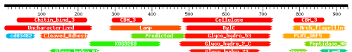
Color schema by PFAM is quite clear – the same domains have the same colors. PFAM (as well as following two servers) shows in the picture partial hits – this is the case where similarity between the domain and the protein spans only fragment of the domain (that may indicate many things, like genomic rearrangements, frameshifts, weak domain definition, etc). But PFAM script can actually plot many other sequence features onto the picture. You can use the script with your own annotation data here – the input is coded as a xml file conforming PFAM’s schema.

CDD looks pretty similar to the PFAM and shares some visual features. However, CD-Search page shows in a graphical way more than one line of hits. Usually the first line contains the best hits for the particular fragment, and following lines show overlapping hits with worse score. Here is shown only the first line.
OK, I may be biased here, since the HHpred is coded by my former colleagues, but I really like the domain bubbles from this server. Color schema is different from any other servers: bubbles are colored according to the score, from red (the best) to blue (the worst). Also it shows partial and overlapping hits (here are shown only few, the actual results page spans few screens in my browser). Similar to CDD, HHpred does not plot any other sequence features than domains.
So here are the major domain annotation servers which present results of the prediction in a nice graphical way (there are many others, but not all of them are using this simple way of presenting data, just to mention InterPro). Are these, after all pretty similar, approaches exploring all possible ways of presenting domain structure of a protein? I don’t think so. Watch this site, I may have something to add pretty soon.


nuin
September 24, 2007 at 19:28
Hi
Would you have any good ones for DNA sequences? I have some data that I need to generate good figures.
Paulo
max
September 25, 2007 at 16:16
Paulo, use the UCSC browser. add your annotation as a “custom track”, export to pdf. you can add colors, links, etc. I found UCSC usually sufficient and you can re-work the pdf before submitting in something like illustrator…
Akhilesh Pandey
September 25, 2007 at 16:45
Have you looked at Human Protein Reference Database. Try the link below for a representative entry:
http://www.hprd.org/summary?protein=01819&isoform_id=01819_1&isoform_name=Isoform_2
freesci
September 25, 2007 at 18:29
Hi Paulo, unfortunately annotation of DNA sequences is not my area of expertise. Hopefully the suggestion of Max will work for you.
Hi Akhilesh, I completely forgot about other than general annotation servers (forgive me, I work in bacterial subsystems). The graphics of HPRD entries looks pretty neat – I liked for example a difference between phosphorylation and dephosphorylation. I hope to include it in a second part of this survey.
Pedro Beltrao
October 1, 2007 at 17:37
I am in EMBL so I am biased but I like SMART. You picked a protein that apparently does not have any hits with SMART so it is showing the PFAM hits. The SMART hits look a bit nicer :). Still, I guess your point is that there has been very little change in how we represent protein domain information on a picture.
freesci
October 1, 2007 at 19:22
You’re right Pedro – they do not look that much different. I focused here on the differences, but in fact there was not that much to write about.
While I don’t use SMART that much because of its sensitivity, I was using its scripts for my own servers for some time :).
alexbateman
October 27, 2009 at 12:26
The Pfam domain graphics have changed with the new Pfam release 24.0. Graphics are now rendered on the client side. Because we have switched over to using HMMER3 there are now more partial hits to domains. An example protein is shown here:
http://pfam.sanger.ac.uk//protein/VAV_HUMAN