One of the key step in the analysis of unknown protein sequence is identification of domains that constitute that protein. There are many online tools that will search for a presence of known domains or identify them ab inito. Usually only the former present results in a graphical way called “domain bubbles”. Below you can find examples of common approaches to presenting results of a sequence annotation. Since most of them use the same domain definitions, names of the hits are the same in almost all cases.
One note: it’s not a comparison of the servers’ performance. The sequence is the same in all cases, but that was to show the differences between visualization methods, not the quality of the annotation.
SMART

This is example of sequence annotation by the SMART server. Domains are colored according to their source (SMART has a collection of domain definitions from various different sources), and non-domain sequence features (like transmembrane segments, low-complexity, disorder) are clearly differentiated from domains. The picture is generated with GIMP and it’s Perl-Fu extension and the script is available for download from a homepage of Ivica Letunic.
PFAM

Color schema by PFAM is quite clear – the same domains have the same colors. PFAM (as well as following two servers) shows in the picture partial hits – this is the case where similarity between the domain and the protein spans only fragment of the domain (that may indicate many things, like genomic rearrangements, frameshifts, weak domain definition, etc). But PFAM script can actually plot many other sequence features onto the picture. You can use the script with your own annotation data here – the input is coded as a xml file conforming PFAM’s schema.
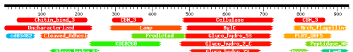
CDD

CDD looks pretty similar to the PFAM and shares some visual features. However, CD-Search page shows in a graphical way more than one line of hits. Usually the first line contains the best hits for the particular fragment, and following lines show overlapping hits with worse score. Here is shown only the first line.
HHpred
OK, I may be biased here, since the HHpred is coded by my former colleagues, but I really like the domain bubbles from this server. Color schema is different from any other servers: bubbles are colored according to the score, from red (the best) to blue (the worst). Also it shows partial and overlapping hits (here are shown only few, the actual results page spans few screens in my browser). Similar to CDD, HHpred does not plot any other sequence features than domains.
So here are the major domain annotation servers which present results of the prediction in a nice graphical way (there are many others, but not all of them are using this simple way of presenting data, just to mention InterPro). Are these, after all pretty similar, approaches exploring all possible ways of presenting domain structure of a protein? I don’t think so. Watch this site, I may have something to add pretty soon.


Manual sequence analysis – some common mistakes
This is a topic I probably will come back to on many occasions. Publication with very wrong sequence analysis like the one Stephen Spiro pointed out on his blog is not an exception. I may agree that large scale analysis can stand quick and dirty treatment of protein sequence (and some error propagation at the same time). In large scale analysis nobody cares if the domain assignment is 100% right (it isn’t), if there are false positives (there are) or even if the material to begin with (protein sequences for example) is free of errors (it is not) – as long as the overall quality of the work is acceptable. However, this optimistic approach cannot be applied to the manual protein sequence analysis. Simply errors introduced in such cases are a way more important. How to avoid some of these errors? A few common mistakes that come to my mind are:
It’s so far all I could think of. Do you have any other suggestions? Let me know.
Posted by Pawel Szczesny on September 25, 2007 in Comments, Research, Research skills